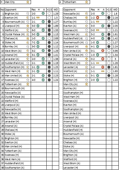
Of the entire report, I’m most intrigued by the side-by-side comparison of results in the last table. Not only utilizing KPI icons to visualize form (much the way sites use colored squares), but then what I perceive as the strength of the team using the stars. Is that correct? If so, how do you quantify the strength of each team?
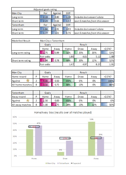
The bar chart was a little difficult for me to read, but might just be a formatting issue.
Nonetheless, very interesting Steve. Followed you for a while and appreciate your insight.
Thanks for the feedback. I’m trying out different formats to illustrate and inform match result likelihood. Yes the stars are simple way to categorise team strength based on my adjusted goals rating. I’ll try to improve the format and add some explanations.

Of the entire report, I’m most intrigued by the side-by-side comparison of results in the last table. Not only utilizing KPI icons to visualize form (much the way sites use colored squares), but then what I perceive as the strength of the team using the stars. Is that correct? If so, how do you quantify the strength of each team?
The bar chart was a little difficult for me to read, but might just be a formatting issue.
Nonetheless, very interesting Steve. Followed you for a while and appreciate your insight.
LikeLiked by 1 person
Thanks for the feedback. I’m trying out different formats to illustrate and inform match result likelihood. Yes the stars are simple way to categorise team strength based on my adjusted goals rating. I’ll try to improve the format and add some explanations.
LikeLike